Flightless Star Demo Update - Redrawing planets and background
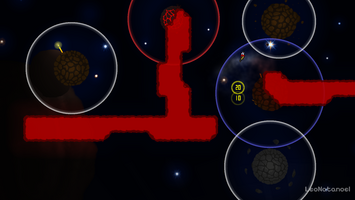

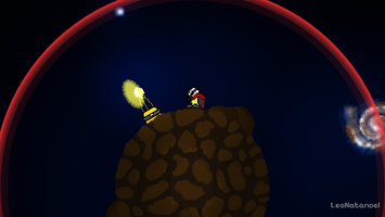
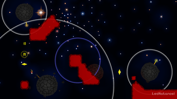
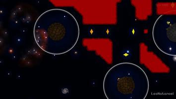

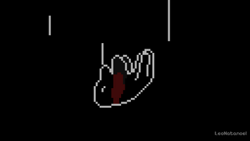
So… I changed my mind...
The previous update should have been the last one, the intention was going to focus on finishing the complete game. But after wandering about some of the reasons for the little interest in the game (of the small people that visited the game page, almost none downloaded it) and searching for what could be improved made me feel pretty insecure with the visuals (again), more specifically, the background and the planets.
The planets were very ugly, making a cross section of them sounded like a good idea, but they ended up looking like weird painted circles (yes they technically are, but it shouldn't look so obvious). The background was kinda cool, but also very bland and uninspired, and it would barely move so the player was stuck with the same view for the entire demo.
So I decided to stop developing in the middle of the second level, take a step back and focus on these problems.
Pretty planets
It took way more time than I expected (especially the grass planets, allowing players to touch grass can be very exhausting), but the improvements are very visible.

Also, I made at least 2 sprites for the same type of planet to add more variations.
Another clever change was to spin randomly every planet when the level begins, so even if two planets have the same sprite and speed they will not look identical.
But that was not enough. I decided to follow the PAINFUL idea to add props in the planets, like bushes, rocks and wreckage. There are 30 levels in the game, each have more than 3 planets... and I decided to add at least 3 props for each one... it was a very tedious morning ;_;
Pretty background
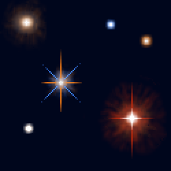
Then came the biggest and hardest change, the background. After some inspiration and references with the help of our old friend NASA, and their huge telescopes (Webb and Hubble), a lot of trial and error and even more redraws and reviews, it was done. Then more redraws and touch-ups, and it was done. Then again...
The new background has double the size of the older one, so it moves a lot more, and has a lot of diferent views like a star cluster, nebula and some galaxies.
Pretty others
And there is more:
And that's the update. Even though it was very significant, it took longer than I expected. I'm still wondering how much I will have to cut from the final game to be able to finish in 6 months. On the other hand I'm having great new gameplay and story ideas for the game.
But. as I said before, the future is a little uncertain (as always), it all depends on how things will go in the next 2 months. Maybe by then I will have a better picture to predict how much I should invest (of money and time) in this game.
I hope you have a great day and stay safe.
Files
Get Flightless Star - Demo
Flightless Star - Demo
Lost in space, a little bird must jump into the void and overcome its dangers to return home.
| Status | In development |
| Author | LeoNatanoel |
| Genre | Platformer |
| Tags | 2D, demo, Difficult, Flying, Gravity, Pixel Art, Short, Space, Speedrun |
| Languages | English |
| Accessibility | Subtitles |

Leave a comment
Log in with itch.io to leave a comment.